Stellenbosch
University
Brand Transformation
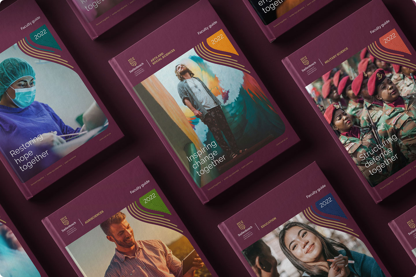
Stellenbosch University is a century-old South African institution recognised globally for academic excellence, research and innovation, but its visual identity hadn’t kept pace. Over time, the brand became fragmented, with more than 170 internal logos and sub-identities across faculties and centres, creating confusion and diluting its presence.
industry
retail
services
immersion
stakeholder engagement
brand development
brand design
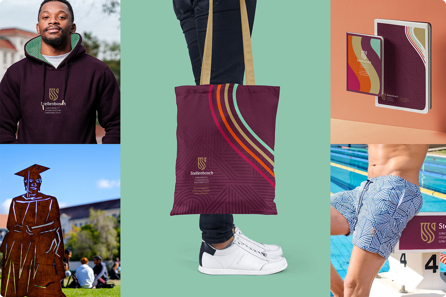
The challenge was to honour SU’s heritage while signalling transformation, inclusivity and a future-focused mindset through one coherent story and visual system.
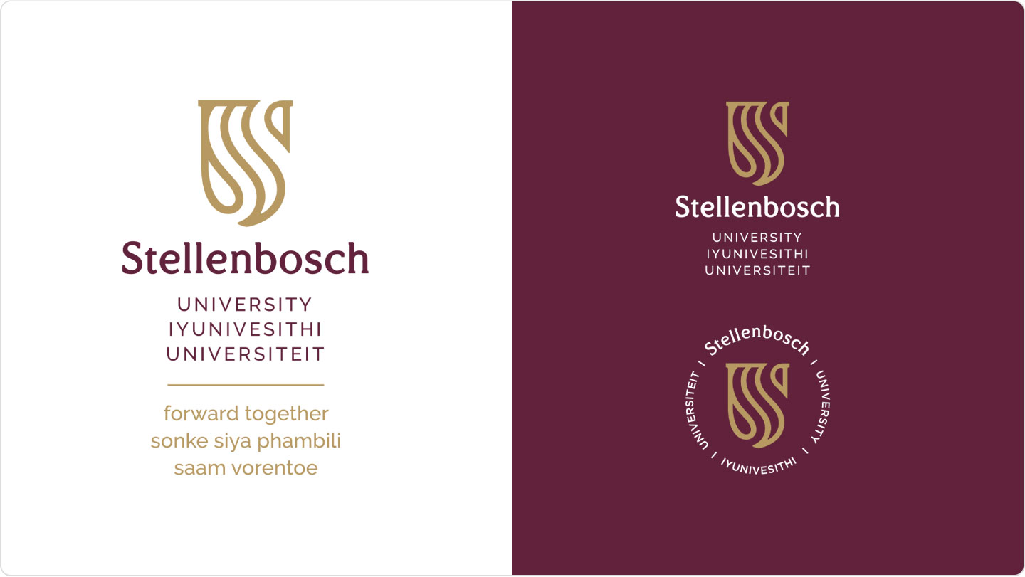
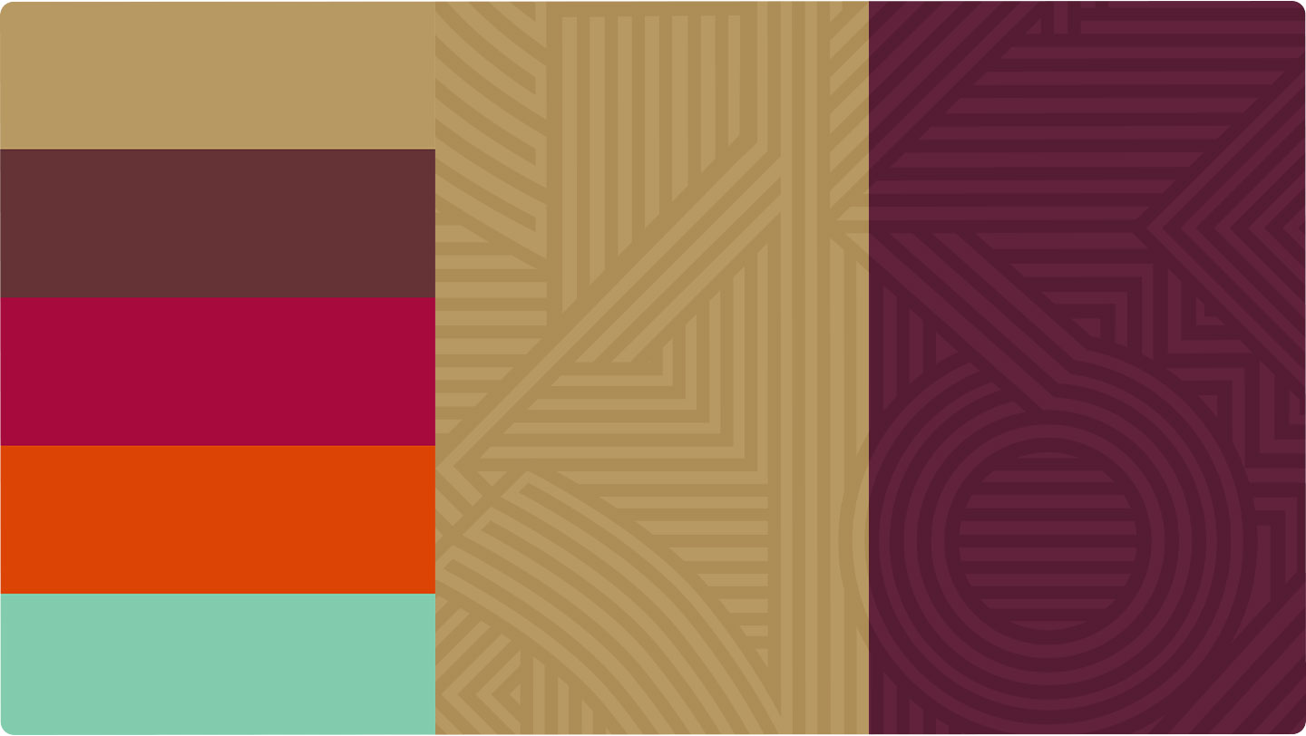
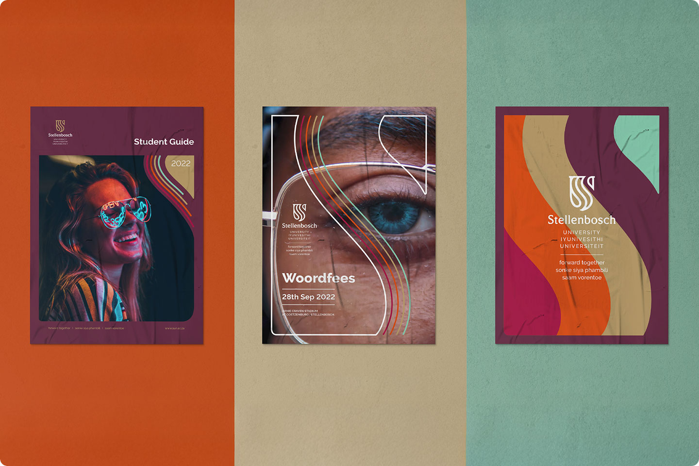
Rooted in the positioning “Pursue, Discover, Together”, the new identity emerged from extensive engagement and a clear desire for something abstract yet meaningful. At its heart are the rhythmic streams of the ‘S’ and ‘U’ symbols. These dynamic lines represent multiple paths, perspectives and disciplines converging towards shared goals, infused with the warmth and energy of South Africa. It delivered a flexible visual language to adapt across digital, print and environmental touchpoints, unifying faculties while still allowing expression.